
PINCH
MOBILE APP
Creating an accessible way for volunteers to find community service opportunities near them based on a variety of filters through a mobile app and website.
My Role:
UX Designer | UX Research | Interviewer
I handled the entire project from the research to the wireframing to the completed prototype.
Programs:
Figma | Procreate | Adobe Ps | Google Suite | Miro
Applied Skills:
User Personas | User Interviews | User Flows
Competitive Analysis |Affinity Mapping
Ideation | Design Principle Implementation
Wireframing | Prototyping | Usability Tests
Timeframe:
4 week sprint
Product Goal:
The idea for this project was to create something that had not been done very well yet in the app space. The vision was to To create an accessible way for volunteers to find community service opportunities near them based on a variety of filters.
Research
I conducted a competitive analysis of other comunity service websites, asked around my community who matched the user audience, did research on volunteers across America through articles, and conducted a usability study once a prototype was available.
Competitive Analysis
COMPANY
Direct
Competitior
Located
Pleasanton,
CA
Just Serve
Online
Only
NYC
NYC
Volunteer
Match
Offers Multiple
Products
Unique Value
Proposition
Target
Audience
All
Volunteers
(USA) HS &
College
Students
Skilled
Profession.
& Non-
Profits
Business
Size
Medium
Small
Medium
Medium
Mobile
App
Taproot
Foundation
Do Something
.Org
All
Volunteers
Personas

MARY TRELLIS
Age:
Education:
Hometown:
Occupation:
52 yrs
Bachelor's Degree in Business Admin
Salt Lake City, UT
Data Analyst
Goals:
-
To use free time helping the community in any way possible
-
Limit time spent researching activities to participate in and causes she would like to support
Frustrations:
-
"I have a hard time finding activities that work with my family's schedule."
-
“I hate spending hours of my time searching for activities near me only to realize that I am not a fan of cause or company.”

BIANCA MILLER
Age:
Education:
Hometown:
Occupation:
35 yrs
Masters Degree in Literature
Chicago, IL
English Professor
Goals:
-
Limit time spent finding volunteer activities to cost participate in
-
Find activities that range in time slots because of her busy life
Frustrations:
-
Not having community service activities near her listed in one place
-
No time slots given for community service when she does find something that she is interested in
Design Architecture


Ideation
I did the crazy eights practice and then created paper wireframes to get a feel for how I wanted to layout the app. To get a better feel for how things would look, I did a version with words as well.


Digital Wireframes

User Testing
I conducted an unmoderated usability study with 1 female and 2 males (all 25-60 yrs old). I made sure to come up with specific tasks I wanted them to complete and it most definitely gave me vital feedback needed to improve the app.
Key Performance Indicators:
-
Time on task
-
Use of navigation
-
System usability scale
Research Tasks:
1
Open up the app and go through the process of finding and booking a volunteer activity near you (Salt Lake City, UT)
2
Open the app, login to your account and go to the profile page
3
Open the app and browse the volunteer activities using the filter feature. Then book the activity.
Usability Study Findings
Round 1 Findings:
1
Users found it unclear on where to start their journey on the home page
2
Users felt the filter section was confusing to get out out/close
Round 2 Findings:
1
Users wanted to see a favorites section for events they liked while searching
2
Users wanted to see time slots shown on the search page rather than just the specific event page
Mockups
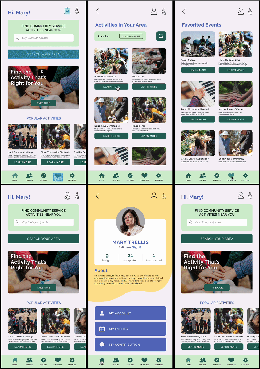
Below are the mockups before and after the usability testing. I added in color, typography, images, and edited some of the layout based on the feedback I received.


High Fidelity Prototype


Tasks to Complete:
1
Open the app and go through the process of booking a community service activity
2
Book an activity and use the filter feature
3
From the home page, browse through the favorites section and the profile page
Final Polished Designs
Below are the mockups that I decided to clean up a bit by making sure everything had text where it should.

Results & Takeaways
After completing the mockups with the feedback given from the usability test, I was able to go back and ask 2 participants to go through the app and see if there were any issues. The participants did like the updates, but did give feedback on not being able to see times for the activities on the search page. The takeaway from this project was that I learned to keep the design a bit more minimal and the users found it easier to navigate through the app. I now want to go back in and add a few more pages and interactions, such as the settings page, the account page, and the friends page.
Let's Connect!
Email: bboitano8@gmail.com
LinkedIn: linkedin.com/in/briana-boitano-dlfdesign


