
BLACK DAHLIA
FLOWER DEALER
Creating an accessible marketplace to buy and send flowers through a local florist where apps have barely been explored.

My Role:
UX Designer | UX Research | Interviewer
I handled the entire project from the research to the wireframing to the completed prototype.
Applied Skills:
User Personas | User Interviews | User Flows
Competitive Analysis |Affinity Mapping
Ideation | Design Principle Implementation
Wireframing | Prototyping | Usability Tests

Programs:
Figma | Procreate | Adobe Ps | Google Suite | Miro
Timeframe:
3 months
Product Goal:
The idea for this project was to create something that had not been done very well yet in the app space. The vision was to To create an app that is easy to navigate for the user and gives them a pleasant experience when purchasing flowers based on a number of factors, such as price point, style, and option variety.
Research
I conducted a competitive analysis of other florist websites/apps, interviewed people who matched the user audience, did other research on users' flower purchases, and conducted usability studies once a prototype was available.
Competitive Analysis
COMPANY
Direct
Competitior
Located
Price
Business
Size
Target
Audience
Offers Multiple
Products
Unique Value
Proposition
UrbanStems
Enitre
USA, DC
$
Large
M/F
17-85
USA
Bloomsy Box
CA, FL
South
America
$$
Small
M/F
17-85
USA
Postal Petals
CA
$$$
Small
M/F
25-85
USA
Petalled
DMV
$$
Small
M/F
17-85
USA
Personas

ELIZA SIMMONS
Age:
Education:
Hometown:
Occupation:
45 yrs
Masters in Accounting
Syracuse, NY
Accountant
Goals:
-
I just want to find a pretty floral arrangement that I think is going to make someone smile
-
I want to have the option to add a pretty container for the flowers and have the price be clearly known
Frustrations:
-
"I never know if I can get a floral arrangement with or without the fancy."
-
“I hate using flower websites because they are hard to navigate.”

ELI POWELL
Age:
Education:
Hometown:
Occupation:
27 yrs
Bachelor's in Fine Arts
Tallahassee, FL
Videographer
Goals:
-
I want to be able to order flowers efficiently and it be cost effective
-
I want the flowers I get to be aesthetically pleasing and really make an impact in my home
Frustrations:
-
“It is hard to try to find flowers that are unique/interesting for a decent price.”
-
“I never know what type of aroma the flower will have when searching for them online.”
Design Architecture


Ideation
I did the crazy eights practice and then created paper wireframes to get a feel for how I wanted to layout the app. To get a better feel for how things would look, I did a version with words as well.


Digital Wireframes


User Testing
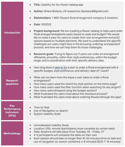
I conducted an unmoderated usability study with 3 females and 5 males (all 23-55 yrs old). I made sure to come up with specific tasks I wanted them to complete and it most definitely gave me vital feedback needed to improve the app.


Usability Study Findings
Round 1 Findings:
1
Users want a more clear way to order flowers from the home page
2
Users want a delivery option available on or close to the checkout page
3
Users want to be able to have customization when ordering flowers/plants
Round 2 Findings:
1
Users want to see the order button more simplified & clear on the home page
2
Users want the container button/task to be made a bit more clear
3
Users want to see all buttons have a bit more breathing room (profile pg)
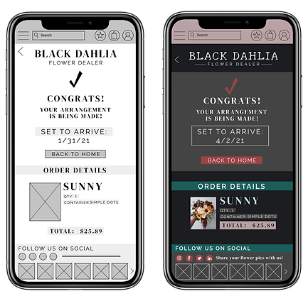
Mockups
Below are the mockups before and after the usability testing. I added in color, typography, images, and edited some of the layout based on the feedback I received.


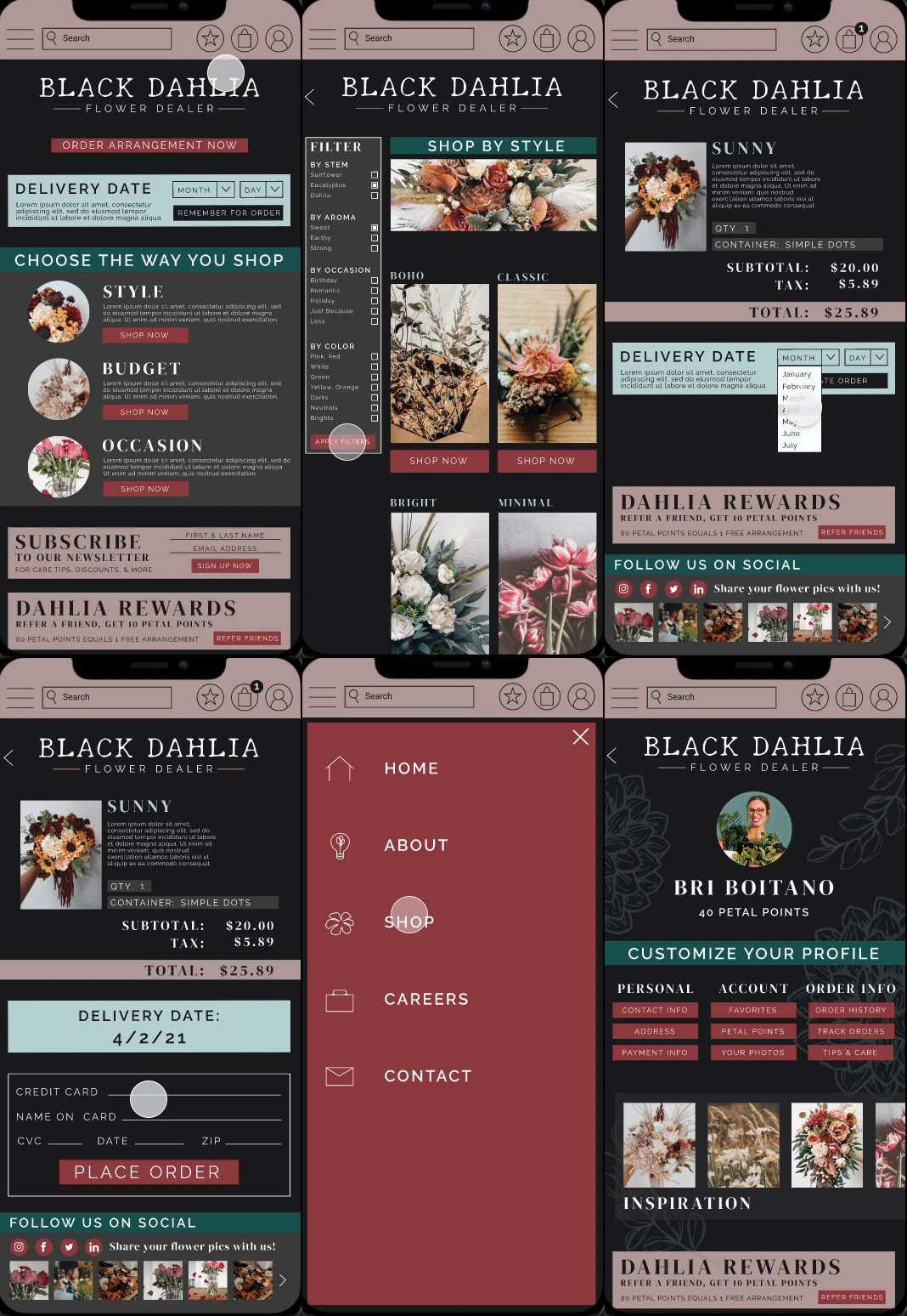
High Fidelity Prototype


Tasks to Complete:
1
Open the app and go through the process of ordering a floral arrangement
2
Order an arrangement and add a container to your order
3
Start the ordering process and apply specific filters before completing
4
Use the navigation menu to shop and nav icons to go the profile page

Final Polished Designs
Below are the mockups that I decided to clean up a bit by giving everything from buttons to sections and text more breathing room, therefore it would be easier for the user to navigate through the app.


Results & Takeaways
After completing the mockups with the feedback given from the usability test, I was able to go back and ask 2 participants to go through the app and see if there were any issues. The participants did like the updates, but did give feedback on the app still feeling a bit crowded. The takeaway from this project was to really hone in design principles for the next case study and to also attempt at creating a responsive website version.
Let's Connect!
Email: bboitano8@gmail.com
LinkedIn: linkedin.com/in/briana-boitano-dlfdesign


